Recently I was testing various online products and plugins such as Webflow (website builder), Spline (online 3D authoring tool), Model Viewer (3D model viewer for web browsers) and 3D Viewer (WordPress plugin), to name a few.
It’s actually great to have all these just at the tip of your finger. Just Google something that you are looking for, and boom, most of the features that you can think of are already available in some ways. Isn’t that great?
Sure…, but the problem is that whichever cool product you find, you will end up discovering that you have to pay in order to get something meaningful out of it. Yes, I understand. It’s still generous that they all offer free versions. But all of their business models are carefully crafted so that if you are serious about accomplishing something solid, you have to upgrade to the paid version. It’s annoying.
Below is an example of Model Viewer, a WordPress plugin rendering glTF 3D model exported from another service called Spline. Model Viewer actually worked great, but Spline did not let me export materials which includes colors) in their free version. That’s why all the cubes are in white.
I was also playing around with Webflow, and tried embedding Spline scene in a page. I may still need to check more if I did everything correctly. But my Spline scene never loaded in my Webflow page. Instead, my Webflow page seemed to be rendering Spline’s dummy scene. I have a feeling that the free version of Webflow does not let you embed your Spline scene…
I just launched UX Resource Map Next, and I’m really excited to share this news with you. This is a 94 page free ebook to help aspiring to-be UX designers finding their ways to become UX designers by providing UX resource landscape.
The previous version: UX Resource Map
The previous version called UX Resource Map has been available for the past few years, and very popular.
UX Resource Map was a 41 page ebook that covered an overall UX resource landscape including college courses, bootcamps, online courses, books and blogs.
It also covered UX designer’s journey, how people have become UX designers through what kind of career path. It also included what are the traits of great UX designers.
While UX Resource Map already had so much valuable information on UX resource landscape, the new UX Resource Map Next is a major upgrade to the previous version.
In addition to all the content from UX Resource Map, I added several new content.
Let’s take a closer look at what’s newly added here.
What’s new in UX Resource Map Next
UX designers traits are now its own section with 12 pages, explaining each trait more in-depth.
The next section, “UX does not exist in a vacuum” is a completely new section dedicated for stressing the importance of collaborating with PM and engineers to be successful as a UX designer working in a product team.
This section is based on a Medium article that I published previously with a title called, “UX/PM/engineer collaboration – a critical factor for a product’s success”. I consider this as one of the most important things that anyone who wants to become a UX designer should understand.
The last section, “Looking into the future” is a completely new write up, where I share my high-level perspective on how relevant a UX designer as a profession is going to be in the near future given where technology is headed.
This section also talks about concrete, pragmatic skills. This includes how to start your own project. UX process vs. creativity. Design systems. Roles and responsibilities of UX designers. UX designers’ roles as evangelists.
Download now
Reading through this ebook will definitely evoke a lot of thoughts and excitements in you.
It should give you a much clear idea on how to move forward. It should also give you what action you should take next to start pursuing your exciting career to become a UX designer!
The link to download UX Resource Map Next is this.
There’s so much in here that I cannot explain in this short article.
This is something that you should download. Take time and read through carefully at your own pace.
Which is why I made this as a free ebook. Anyone who wants to become a UX designer and eager to learn can download and own it.
So, happy downloading, and good luck with your career!
Bank called me for a suspicious online transaction
I ordered something online from a merchant that I don’t usually use. Then I got a call from my bank saying that they detected an online transaction that was suspicious.
This was actually my own purchase, not a fraud so I told the bank person.
But she said because they thought that it was a fraud and blocked the transaction, I had to place the same order again to the merchant.
So I placed the same order again at the merchant’s online store following the bank’s advice.
After placing my second order and a few minutes later, I received two emails from the merchant saying “your item has shipped”.
Apparently, my first order was not blocked. It went through against what the bank staff told me.
Canceling one of two orders
Now I had to contact the merchant, and explain the situation to cancel my first order.
The merchant customer support responded back to me that they put a cancel request to my first order, but there was no guarantee that their request went through.
After my order arrived, I checked the tracking for both of my orders. On FedEx tracking site, it showed that my first order that I canceled was pending. It’s a good sign that their cancellation might have worked.
Duplicated charges, then refund posted
But when I checked my bank credit card statement, it had charges for both orders.
So I called the bank and explained the situation.
The bank staff was friendly, and said that they could see the refund was coming from that merchant, which was not processed yet. The banker suggested that I check my account a few days later to see if the refund was posted or not.
When I checked my account a few days later, the refund was still not posted.
After about a week from when I contacted my bank, the refund from the merchant finally appeared on my bank credit card account.
This should have been the end of everything.
But it wasn’t.
An online transaction resulted in 5 items total
Because my initial report to the bank about the duplicated charge was considered as a dispute, the bank also credited back the same amount.
This resulted in having a duplicated “refunds”, one from the merchant, the other from the bank. Now, there was a total of 4 items:
The initial charge from the merchant
The second charge from the merchant
A refund from the merchant
A refund from the bank based on the “dispute”
Because above 4 items canceled out transactions to zero, the bank added the 5th item, which was to subtract the same amount from my account, so that only a single amount was charged to my credit card after all these pluses and minuses.
Closer look at the problem
At the end of the day, it all worked out.
But it took quite some time, I had to keep checking my account for several weeks, and I had to make several phone calls and emails to confirm all these.
Maybe I was too anxious.
I’m still wondering if there was a better way to handle the situation.
What exactly did the bank block?
Was the blocking towards that particular transaction, or the merchant?
Was the blocking towards that particular transaction, or towards the merchant?
Since the transaction did go through after the bank unblocked it, I have a feeing that the block was against the merchant instead of the transaction. If the block was against this particular transaction, it should not have gone through.
Now, this is still my assumption, so I could be wrong.
Service to service integration in online transaction
Fixing this kind of systemic flaw should also reduce customer support efforts on banks, credit card companies and merchants side significantly too.
But who owns this type of issue could fall into a grey zone somewhere in between.
I hope that more and more UX designers get involved in solving this type of service to service integration problems moving forward which might fall through cracks otherwise.
When I initially researched about LLC move in the internet, I found various information. It gave me 3 options:
Option 1 – Transfer an LLC from one state to another for a permanent move
Option 2 – Keep an old LLC and register in a new state as a foreign entity
Option 3 – Dissolve an old LLC and create a new one for a fresh start
I went with option 1.
I also found out that this is called “domestication”.
Step 2: Identified responsible organizations in both CA and AZ
I knew that California side was California Secretary of State.
Arizona side was called Arizona Corporation Commission.
Step 3: Contacted both organizations over the phone, and identified required documents and steps
I called California Secretary of State and asked requirements on California side if there’s anything that I had to do to “move out” my LLC from California. It turned out that there’s nothing except dissolving my LLC once it’s domesticated in a new state.
Then I called Arizona Corporation Commission and asked requirements to “move in” my LLC to Arizona. They said that I had to submit “Statement of domestication” form. But it turned out that I also had to submit Article of organization.
After researching on both states, it turned out that there’s no linkage between two states.
So here are the full requirements that I needed to submit to Arizona Corporation Commission in order to transfer my California LLC.
File a Statement of domestication
File Articles of organization with Member structure attachment and Statutory Agent Acceptance form
Pay a total of $100 filing fee by check
Send everything via traditional mail to Arizona Corporation Commission
Step 4. Subscribed to an agent service
In order to file articles of organization in Arizona, I had to get a new agent in Arizona.
After some research, I subscribed to an agent service called ZenBusiness, and had them sign Statutory Agent Acceptance form.
Their cost was $99 per year, and they are quite responsive.
Step 5. Subscribed to a UPS mailbox
In order to protect my privacy, I subscribed to UPS mailbox as an address for my home office-based LLC.
UPS mailbox service fee varies based on region. In my case in AZ, it was $252 annually plus a setup fee $15 which totaled $262 for the first year. In California, the same service was $599.
Step 6: Submitted my LLC filing to Arizona Corporation Commission
Here’s AZ Statement of Domestication form. It’s a 2 page form.
On page 1,
1 domestication entity name, I entered my LLC name.
1.1 domesticating entity jurisdiction of organization: I entered California.
1.2 For domestication entity type, I entered LLC.
1.3 domesticating entity original date of incorporation/organization: I entered the date I filed my LLC in California.
2.1 domesticated entity jurisdiction of organization: I entered Arizona.
2.2 domesticated entity type: I checkmarked “Arizona LLC”
On page 2, at the bottom, I entered entity name, which is my LLC name,
Signed with a date, printed my name and title.
As for the title, I made a mistake by typing it initially as “Founder”. Which was the reason my initial filing got rejected. This had to be “Member” instead as written in member structure attachment of Articles of organization.
Here’s Articles of organization. It’s a 2 page form.
On page 1,
1. Entity type: I selected Limited liability company.
2. Entity name: I entered my LLC name.
3. I left it blank as my LLC was not professional limited liability company.
4. Statutory agent for service of process
4.1 I entered statutory agent name, address that I got from Zen Business.
4.2 I checkmarked as the mailing address of statutory agent is the same as physical address.
5. Principal address
5.1 I selected No, as the Arizona principal address for my business is different from the address of the statutory agent.
5.2 I entered my principal address for my business, which is my UPS mailbox address.
7. I checkmarked as my LLC is member-managed LLC.
At the bottom of the form, I signed with a date, and entered my printed name.
Here’s Member structure attachment.
1. Entity name: I entered my LLC name.
2. Members: I entered my name with my business address.
Here’s Statutory Agent Acceptance form.
This is the form that has to be signed by your agent.
I sent this form to Zen Business, had them fill out and sign, then send it back to me. This was pretty quick turnaround with a day or two.
Cover sheet
This is just a minor detail, but Arizona Corporation Commission also asked me to attach this cover sheet per document.
In my case, because I had to file statement of domestication and articles of organization, I attached a cover sheet for each document.
7. My filing got rejected
As I mentioned earlier, I put “Founder” initially for my title instead of “Member” and my filing got rejected. This had to be “Member”, as described in Member structure attachment of Articles of organization. All the LLC owners are called “Members”.
8. Resubmitted my LLC filing
I corrected my mistake, and resubmitted my filing.
9. My filing got accepted
Yay!!!
10. Notified agent about the acceptance
Once my filing was accepted by Arizona Corporation Commission, I notified Zen Business, so that they were able to close a loop on their end as my agent.
11. Dissolved my CA LLC
This was a simple online process, and it was very quick.
Learnings along the way
Looking back, the whole process is totally manageable to handle by myself.
And I’m glad that I did not hire someone else to do this for me for a fee.
But there are a few things that I learned from my experience.
The good thing about LLC in Arizona compared to California is that you don’t have to pay for LLC annual tax of $800 like in California. For a small business, this is a huge saving by itself.
EIN (Employer Identification Number) that I obtained from IRS was nothing to do with my LLC move.
There was no single online system that handled LLC move from one state to another
Things I did on each state were totally disconnected with each other
Forms in Arizona were paper-based, and the filing was via a traditional mail
I wish if there were a single inter-state online system that allowed me to simply select my old CA LLC, then select a state that I’d like to move my LLC into, and complete everything online. Ideally with online chat support as well so that I can ask questions along the way.
But that might be a tough ask as each state operates independently in the U.S.
A user journey is one of methodologies / tools and techniques in a UX design process.
Basically you put yourself in user’s shoes, think through and write down the steps you would go through focusing on a high-level journey of a user.
Let me give you an example.
Here’s a user journey that I wrote down based on my experience when I participated in a food packing volunteer work previously.
Signed up as a team of 5 people prior to the date
Showed up on that day and checked in on-site
Received a cap, stored personal items in a locker
Got an introduction presentation of the non-profit organization
Got an instruction on how to enter the site and what to do
Each team was called one after another
When called, washed hands thoroughly
Moved to an assigned station
Got on-site instruction
Started packing food with music
Count down started and stopped at 2 hour mark
Did a clean up based on the instruction
Left the station, disposed gloves and cap
Watched a closing presentation with results
Once you format these numbered steps into a diagram like this, it’s called a user journey map.
A user journey could also be written as a story that consists of a few paragraphs.
I decided to participate in a volunteer work to contribute to my local community. So I looked for nearby volunteer opportunities, and found one that is close by with dates that work for my schedule.
It turned out that this volunteer work required 5 people to form a team and participate, so I signed up as a team of 5 people prior to the date.
When the scheduled date arrived, I showed up at the specified location, and checked in on-site. After checking in, and entering the building, I received a cap, and stored my personal items in a locker.
Once the majority of the participant checked in, we saw an introductory presentation of the non-profit organization who was organizing this event. The presentation covered an instruction on how to enter the site and what to do.
After the presentation, we were instructed to wash our hands thoroughly, then were guided to an assigned station.
At the station, there was an on-site instruction which covered details on how to split tasks within the team members.
Once the on-site instruction was finished, the music started and we started packing food.
The food packing work continued for about 2 hour straight. During all that time, we were focusing on trying to do our given tasks efficiently. As we repeated the same task again and again, we got better at it, and started to enjoy the rythm of it with the music.
The session went a lot faster than expected. Right before the 2 hour mark, the staff member started counting down. As the staff counted zero, we stopped the food packing work.
We did the cleaning of our station based on the given instruction.
Once the cleaning was done, we left the station, and disposed gloves and caps to a trashcan.
Lastly, we watched the closing presentation.
The organizer showed us how many food packages we packed collectively during this 2 hour session.
They also showed us how much impact those food packages will make.
This closing presentation informed us the actual result of our work in an understandable way.
As a result, I had a very satisfying volunteer work experience for this 2 hour. It was pleasant.
As I was translating my journey map steps into sentences and paragraphs, I ended up adding more information in terms of how I felt, how it transitioned from one step to another and so on.
As you can see, user journey can be described in different ways.
Steps make it easy to grasp an overall flow because it’s like bullet points with shorter descriptions. Steps can easily be visualized into a user journey map format. This is great for clear and logical thinking. From here, you could easily see how a specific step could be broken down into more granular levels such as task flows and wireframe flows.
On the other hand, paragraphs make it a good story with some richer nuances such as emotional ups and downs of a user. You can get a similar feeling to when watching a movie or reading a novel.
As a UX designer, it’s important to be empathetic to a user.
This sentence and paragraph style of a user journey makes it easier to relate to a user in an empathetic way.
But it’s a bit longer, and it’s harder to visually see the overall flow.
Whichever method you end up choosing, the most important point is that, a user journey allows you and other audience to “live through” a user’s experience. It allows you to feel what it’s like to be a user and go through that specific journey. It allows its audience to be empathetic to a user.
In doing so, a user journey especially in a text format, allows you to remain at a high-level focusing on the core journey and the core values, so that you don’t get distracted by all the UI details.
This will greatly benefit you when you design the actual user experience of that journey in form of wireframes and prototypes later on.
So here is Material Design time picker. (below right)
It’s typically paired with a date picker, which is a calendar-based (above left). The date picker works very well. But it’s the time picker that has problems.
Here’s how it works.
You first pick an hour.
As soon as you are done, the UI jumps to show minutes.
You pick minutes, then you are done.
Here are the problems.
Circular analog clock representation is visually interesting, but does not work well, especially because hour and minute are separated.
An automatic transition from hour to minute feels forced, and you get confused especially at the first time.
As a result, it does not fully represent a clock with a long and short needles anymore that it initially took a queue from.
When you switch between hour and minute by clicking the number, “a clock needle” animates from 9 hour to 29 minute, but this animation does not mean anything.
It could have been better if hour and minute are both represented simultaneously in the “clock”, so that it resembles how a real analog clock will look like on that time.
When you compare this to iOS calendar time input UI, I have to say iOS is much better. It allows a user to swipe up/down hour/min, or use 10-key to enter hour and minute altogether.
Now, Material Design also has a different mobile time picker that you can directly type in, which is better than clock-like version.
So what is the lesson from these?
Entering time is such a basic, common things to do in various products and services.
The experience should be as straightforward and crystal-clear as possible.
The UI should use a metaphor that people are already familiar with.
It should not confuse a user.
From this perspective, using a calendar for selecting a date is perfect. We are all used to using a calendar.
But for time, it would be best if hour and minute are not too separated.
And for faster input, direct typing would probably be the fastest and easiest.
I think a scroll wheel for hour and minute separately is fine too. An hour only has 1-12, or 1-24, and minute only has 0-59, which is manageable.
Someone mentioned that Material Design time picker with a circular design is very “designery”.
It’s an interesting remark.
I think it’s fair to say that many designers tend to get attracted to a circle as one of the most beautiful geometric shapes.
Analog clock is a manifestation of that as a symbolic representation of time.
While it makes perfect sense to make time picker using an analog clock metaphor because it’s about time, ironically the result feels wonky.
This illustrates an interesting aspect of user experience. How you feel is what ultimately matters, rather than the pure logic that brought you to your design solution in the first place.
I respect the designer who created this, that she or he, or the team had a courage to try this type of design.
But at the end of the day, this is not the most intuitive, easy to use design, even though it may look interesting and unique on its surface.
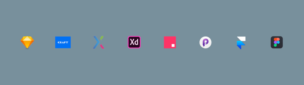
Although tools are not the most important things to learn as a UX designer, inevitably you need to use it in order to achieve your more important goals, to solve user’s problems. This article covers today’s 8 most popular UX prototyping tools including Sketch, Craft, Axure, Adobe XD, InVision Studio, Principle, Framer X, andFigma. First, it compares key aspects such as price, basic prototyping features, Sketch compatibility. Then it covers a high-level overview of each software program in terms of pros and cons and uniquenesses.
I understand there are many more tools out there, and other people may have different opinions. I also acknowledge that I am not familiar with every single tool available. I chose these 8 tools based on a combination of popularity and how these tools played key roles in the modern history of prototyping tools, and likely to take part in the future.
When Adobe Flash started going down, Axure took over in Web 2.0 Era, then Sketch came along to become a de facto standard. But lack of prototyping and cloud features in its early days opened up other new tools to emerge around Sketch, such as InVision, Principle, Craft plugin for Sketch, and Adobe XD with a new voice capability. Framer X is tackling a challenging developer handoff problem, which could be the future of prototyping. Figma is getting more tractions lately because it was built for cloud-based collaboration, which is becoming a norm in today’s accelerated remote work situation.
Trends in today’s prototyping tools
Today’s trends in prototyping tools are ”stitch screens with wires” interaction model, accompanied by auto-animate transitions that smartly animate transitions between two screens connected. This makes prototyping super-fast and intuitive for non-tech-savvy UX designers.
Left: “Stitch screens with wires” interaction model, Right: Auto-animate transition smartly look for same objects between two screens and create animations based on parameter changes on size, position, opacity level/etc.
Currently, Sketch is the most popular prototyping tool. However, Sketch is very limited when it comes to creating transitions and micro-interactions with animated effects. This is where other tools have strengths, and all of them have some sort of compatibility with Sketch. Let’s dive in to comparisons of 8 popular prototyping tools.
Comparison of 8 most popular prototyping tools
Price
Price comparison of 8 prototyping tools
Sketch one time price is $99 which includes 1 year of software updates and Sketch Cloud usage. Optional renewal is available for $79/year for software updates and cloud.
Adobe XD is free.
Axure is $495 for its perpetual license, or $29/month subscription.
InVision Studio and Craft are free, but are limited to only 1 prototype in InVision Cloud for free.
Principle is $129 (one time fee).
Framer X is $15/month or $144/year, based on 1 year subscription.
Figma is free with a Starter plan, up to 3 prototypes.
Basic prototyping features
Comparison of basic prototyping features: Based on data as of April 2020. information is all subject to change, whenever listed companies make any changes on their end. The author of this article does not have affiliations with any companies listed. Legends for diagrams shown in a table above, interaction models and artboard structure.
Because the whole point of prototyping is to quickly test concepts, ease of use and speed are critical. In most real world situations, time is very limited, so ability to quickly create a basic prototype just by connecting screens together is super convenient, and that’s all you need in most cases.
From this perspective, Sketch, Craft, InVision Studio, Principle, Figma, Adobe XD, Framer X all do great jobs with similar “stitch screens via wires” interaction models.
Principle creates all the transitions automatically, allowing some controls via timeline UI. This is great for creating a nice animation instantly. But it doesn’t offer the most basic “preset transitions” such as slide, push or dissolve like other tools. For this reason, Principle is positioned slightly to the right in the chart compared to others (except Axure).
InVision Studio also provides a timeline UI similar to Principle, but it also provides basic preset transitions, which makes it a bit easier when it comes to basic prototyping.
Axure uses a very different interaction model. A user has to specify and add every single interaction via Interaction Editor. Interaction Editor is a very powerful tool for building complex interactions, but lacks speed and glance-ability for basic prototyping.
Chart 1: Price vs. ease of use — basic prototyping: Ease of use is evaluated based on the author’s perspective, especially in terms of how easy to build a basic prototype by connecting multiple screens together via transitions.
Above chart shows how 8 tools are positioned on a price vs. ease of use plane. As you can see all the tools except Axure fall under bottom-left quadrant.
Basic prototyping features — animation adjustments
Based on data as of April 2020. information is all subject to change, whenever listed companies make any changes on their end. The author of this article does not have affiliations with any companies listed.Chart 2: Ease vs. fine-tuning capability — basic prototyping: Ease of use and fine-tuning capability are evaluated based on the author’s perspective, especially in terms of how easy to build a basic prototype by connecting multiple screens together, and how much controls you have in terms of sequences, timing and ease in/out.
This chart illustrates how much controls you have when creating a basic prototype, when it comes to sequence of multiple animations, timing and duration of animations, and ease in/out effects. Software programs are broken down into 3 groups.
The group in the top-left quadrant have a good balance of an overall ease of use and ability to fine-tune transitions and animations without too much work. These include InVision Studio, Principle and Adobe XD. All three do pretty good job in creating auto-animate transitions. Although similar, Principle seems to create the smoothest animations in most cases.
Figma recently added Smart-Animate feature, but currently it’s lagging compared to above three programs. Framer X can do fine-tuning but only via code. Sketch and Craft does not support fine-tuning. They only support basic preset transitions.
Axure can do many complex interactions, but only via Interaction Editor, which is not the simplest way from basic prototyping perspective.
Sketch compatibility
Based on data as of April 2020. information is all subject to change, whenever listed companies make any changes on their end.
Currently, InVision Studio is the most Sketch-compatible program, which supports opening Sketch file directly as well as copy & paste objects and symbols from Sketch.
Adobe XD supports opening Sketch file directly, but copy & paste from Sketch doesn’t work. Principle can import Sketch file almost the same way as opening, but copy & paste does not work. Figma can import Sketch file but takes time. Copy & pasting a Sketch object does not work. Framer X accepts copy & pasting a Sketch object, but cannot directly open or import Sketch file. Axure can take copy & pasted Sketch object, but only via Axure plugin installed to Sketch.
Chart 3: Price vs. Sketch compatibility: Based on data as of April 2020. information is all subject to change, whenever listed companies make any changes on their end.
Advanced prototyping
Based on data as of April 2020. information is all subject to change, whenever listed companies make any changes on their end.Chart 4: Price vs. advanced prototyping capability: Evaluated based on the author’s perspective.
When it comes to advanced prototyping capability, Axure covers pretty much any interactions possible to simulate how the actual product is going to feel like via Interaction Editor except voice interaction. But Axure does not support videos. (Axure supports GIF animations)
Framer X is another tool that has a potential to add a lot of advanced interactivity to a prototype. One of the unique advantages of Framer X is that it supports video and audio. You can even embed YouTube video and run it inside your prototype, which is pretty powerful. While Framer X has a store to download many useful components, many of advanced interactivity need to be added via code.
Principle has an interesting and unique feature called Drivers, which can add various micro-interactions quickly to make the prototype look real.
Adobe XD allows you to create voice interaction, which stands out from competition in this area as no other tools support that.
Sketch, Craft and Figma are fairly basic, so does not support advanced interactivity at this point.
Running a prototype on mobile
Based on data as of April 2020. information is all subject to change, whenever listed companies make any changes on their end.
All the software programs have mobile apps to run a prototype except Framer X. Framer X is lagging in this area, where a prototype can only run inside a mobile web browser via QR Code.
Sharing a prototype online
Capability of sharing a prototype online across 8 prototyping tools
Principle falls short in this area as it does not have a cloud. In order to share a prototype in Principle, you need to either send a Principle file and have it open from Principle mobile app, or export a prototype as a Mac Desktop app to be viewed on a Mac that doesn’t have Principle app installed. This means you cannot share a prototype with Windows users.
3rd-party ecosystem
Based on data as of April 2020. information is all subject to change, whenever listed companies make any changes on their end.
While Sketch remains strong in this area with its abundant plugins, Adobe XD and Figma are catching up. Framer X has a unique approach with its Store, which is super-easy to browse and download functional components such as YouTube Player. Moving forward, Adobe may have a powerhouse advantage in a near future, as seen in innovative new feature such as voice interaction. Many of popular Sketch plugins are already getting ported to Adobe XD too.
Collaboration capability
Based on data as of April 2020. information is all subject to change, whenever listed companies make any changes on their end.
As for collaboration within a team, Principle falls short. Adobe XD and Figma offers free collaboration feature. Sketch offers a separate subscription for Team feature. Axure has a separate software that supports Team feature called Axure RP9 Team. InVision Studio offers additional subscription for Team feature. Craft uses InVision Cloud. Framer X has Small Teams plan that allows access to Team Store.
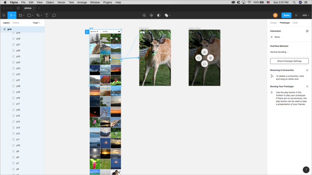
1. Sketch (based on version 63.1)
Sketch UI showing 3 screens connected using prototype feature.
Sketch is the most popular tool, a de facto standard with various 3rd party plugins. But the default transitions are minimum, animate from right, bottom, left, top only.
Sketch prototype feature, 5 animation options
Pricing: $99 (includes 1 year updates, 1 year Sketch Cloud. Optional renewal is available for $79/year for software updates and cloud. )
Free trial: 30 day
Mac only
Pros:
Abundant plugins
De facto standard
Strong symbol features
Smart Layout
Cons:
Limited transition animation options
No fine-tuning capability for animations
No micro-interaction support
Running a prototype locally, on mobile and in the cloud
https://youtu.be/xI0w4xdk9Ww
Clicking a preview icon on the top right corner allows you to run a prototype locally.
Sketch Mirror app can mirror an open Sketch file on your Mac through the same wifi connection. To mirror a prototype on a mobile app, click Notifications on the top right of the desktop app window, and select a mobile phone running Sketch Mirror app.
Uploading to a cloud allows you to share a prototype with others via a link. This is a great way to share a prototype with others and get feedback.
Smart Layout, plugins
Smart Layout allows automatic resizing of buttons and layouts based on the text lengths.
Abundant plugins are one of Sketch’s biggest strengths compared to its competitors. All the installed plugins appear under Plugins menu, and can be disabled via Preferences/Plugins.
Rename It, one of Sketch plugins lets you rename selected layers or artboards in bulk with numbered names. Adding “%N” in Name field after your desired text string (e.g., rectangle, square, thumbnail) results in layer names with your [desired text string]+number.
Collaboration – Team feature
Sketch has a Team feature which allows you to collaborate. You can access this feature by logging in to your Sketch Cloud, then select Create New Team.
Adding team members cost $9/month per contributor, or $99/year per contributor.
InVision’s Craft plugin enables a slightly better prototyping capability directly within Sketch. These include gestures such as tap, swipe, and transitions such as dissolve, push, slide.
Pricing: free
Mac only (as it’s a Sketch plugin)
Pros:
Free (if you already have Sketch)
More transition controls than Sketch
Smart Duplicate, Data features
Cons:
You need Sketch
Transition options are still limited
Sticky header not supported
Pressing “C” while a layer is selected brings up a blue arrow to link to another artboard, link back, or external URL.
Prototype menu and toolbar are embedded in Sketch
Because Craft is a Sketch plugin, Craft menu appears as an embedded toolbar on the right side of the screen. Clicking on a circular head of a blue link arrow brings up prototype menu. Prototype options that Craft has are slightly more than Sketch’s options as below.
Running Craft prototype locally, in the cloud, on mobile
Craft prototype is very similar to Sketch prototype. Currently a “sticky header” feature is not available.
A prototype uploaded to InVision Cloud can be opened in InVision mobile app to run on mobile. Only one prototype is allowed on a cloud with a free InVision account.
https://youtu.be/b1k5Pvp3epc
Craft prototype running on mobile via InVision mobile app.
Data, Stock
Data pulls real content from a range of sources and place it directly in your design.
Stock allows you to find and place high-resolution imagery from Getty and iStock to your design.
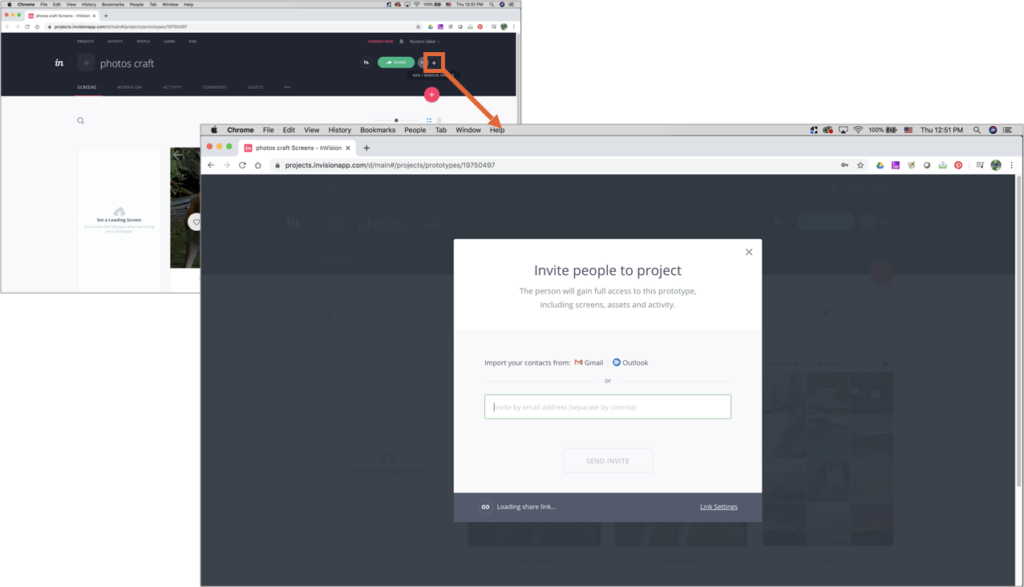
Collaboration
Once a prototype is uploaded to InVision Cloud, clicking on “+” icon allows you to invite a person to collaborate.
Clicking on “+” opens a popup to enter email to invite people.
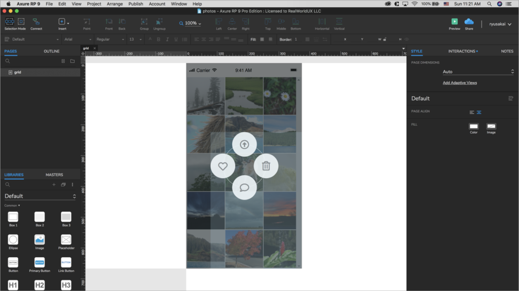
Axure has established its own unique place as a go to prototype tool to build a more robust, complex prototype with various interactions, not just screen-to-screen click throughs.
Many experienced UX designers still use Axure because you can do more, but the trend is more towards software programs with “connect screens with wires” interaction model, because that’s much faster to create simple prototypes.
Can build almost any interactions (except voice interaction)
Unlimited cloud
Cons:
Most expensive — $495 perpetual, or $29/month.
Does not use popular “connect screens with wires” interaction model
Font Awesome not supported in mobile app
Least Sketch compatibility
Interaction Editor and Condition Builder
Interaction Editor allows you to add various complex interactions. Various list of events, actions and tiggers are available in Axure’s Interaction Editor to be able to create complex interactions.
List of available events, actions and triggers available in Axure’s Interaction Editor
In Interaction Editor, Condition Builder allows conditional branching of interactions. This is basically If statement in code done visually.
An example of creating conditions with logic in Condition Builder.
Running a prototype locally, in the cloud, on mobile
Clicking Preview button opens a browser window and runs a prototype.
Publishing to a cloud allows you to share a prototype easily with others to collect feedback.
Axure Cloud mobile app can open a project published on a cloud. Font Awesome did not render.
https://youtu.be/NatQKa2AlEU
Sketch plugin, widget libraries
To enable copy & paste from Sketch, Axure plugin for Sketch needs to be installed in Sketch.
A file needs to be saved to a cloud in order to run a prototype on Adobe XD mobile app.
An XD file saved on Adobe Cloud becomes accessible from Adobe XD mobile app. Font Awesome didn’t render.
https://youtu.be/w4VMd5yq5WM
Repeat Grid and voice interaction
Repeat Grid auto-copies what’s selected as you drag a handle. You can bulk-adjust margins too. It’s a smart productivity tool that works great when creating tables or lists.
Voice interaction capability is the most unique and advanced feature that Adobe XD has. Below you can see the voice prototype in action. Note that you need to hold down a screen while speaking up your voice command that you specified in Speech Playback.
You can type in a voice command that you want to use in Command field after selecting Voice from Trigger.For a Speech Playback, you can select different voice, then enter what you want that voice to speak up.
https://youtu.be/DYgYs7VlF_4
Coediting
To enable Coediting, you first need to save the document to the cloud. Once the document is saved to the cloud, Invite to Document icon gets activated. After clicking Invite to Document, enable Coediting, then send an invite.
Once fellow designers are added, you see them as color-coded avatars and bounding boxes.
InVision Studio user interface showing three artboards linked with its interaction feature.
InVision Studio can open Sketch file, or can take objects and symbols copy-&-pasted from Sketch, and can create a more sophisticated prototype via its timeline-based transition capability.
When opening Sketch files, there are a few things to keep in mind. Link layers in Edit timeline doesn’t support Sketch symbols currently. In order to achieve a smooth animation, a file may need to be optimized accordingly.
Pricing: free
Both Mac & Windows
In order to publish more than one prototype to share online, you need subscription to InVision Cloud.
Pros:
Free
Best compatibility with Sketch
Transition adjustments via timeline
Cons:
Sometimes buggy and sluggish
Cloud only allows one prototype for free
Sync layers does not work for Sketch symbols
Interactions panel
Selecting a layer displays Interactions panel on the right.
Timer, one of triggers, allows certain interaction to happen automatically after a specified number of seconds.
Interactions panel: available triggers and preset transitions
Timeline allows sequencing multiple animations in a particular order to make the overall animation easier to understand.
InVision Studio’s timeline opens when Edit Timeline is clicked from Interactions panel.
Running a prototype locally, in the cloud, on mobile
Principle user interface opens a prototype preview screen by default.
Principle can import Sketch file directly, and can create a more sophisticated prototype.
Its animation is very smooth, with powerful auto-animate feature, which looks for same layer names between two screens.
Components and Drivers feature allow you to quickly create various micro-interactions.
However, there are a few things to keep in mind with auto-animate feature. It could automatically animate many unwanted elements in a screen depending on how layers are named between two screens. To avoid that, your may need to prepare a file in Sketch first by renaming all the layer names carefully.
Pricing: $129 (one time fee)
Free trial: 14 day
Mac only
Pros:
Auto-animate is very smooth
Easy to make micro-interactions with Drivers
Works very well with Sketch
Cons:
Costs $129
Auto-animate sometimes creates unintended animations
Mobile app requires USB connection
No cloud service
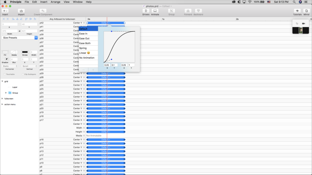
Triggers, Timeline and velocity control
Auto option in Triggers works similar to Timer InVision Studio has, which allows things like a toast appears automatically after an action completes.
Timeline allows you to control duration, ease and sequence of certain animations, or freeze those.
Available triggers and interaction arrowsPrinciple’s timeline UI.
Connecting an iOS device running Principle Mirror app to Mac via USB cable mirrors a prototype on mobile from desktop.
https://youtu.be/9fqCzWqPmI0
Drivers
Below shows a dynamic header that shrinks when a scroll starts, created with Drivers. As shown below, Drivers is a powerful and useful feature to build various micro-interactions.
Framer X is some of newer tools. You can copy & paste Sketch symbols and elements into Framer X artboard, but you cannot directly open Sketch file. Prototyping features for average users are fairly basic, and does not have auto-animate capability. But for code-savvy users, you can use code to do more advanced prototyping.
Figma is unique in a way that it was built primarily as a web application saving it’s files to the cloud by default, even in their desktop version. Figma can import Sketch file, but could take quite some time to complete the import. Prototyping feature is fairly basic.
Pricing: Free
Starter: Free for up to 2 Editors and 3 projects
Professional: $12 per editor/month billed annually or $15 month-to-month
Both Mac and Windows
Pros:
Files are saved to the cloud by default
Free up to three projects, two editors (collaborators)
Well-designed user interface
Cons:
Limited transition options
Cannot copy & paste objects from Sketch (import only)
Free version limited to 3 prototypes
Home screen, prototype mode, prototype panel
Figma has a home screen called Drafts that displays all of your projects. Files are saved to the cloud by default.
Figma has Design mode and Prototype mode, similar to Adobe XD.
Smart Animate was added in 2019 to catch up with the competition.
Figma’s various controls in prototyping: trigger, transition, action
Running a prototype locally, in the cloud, on mobile
Clicking on Play button opens up a new tab and runs a prototype locally.
Clicking on Share Prototype creates a link to share with others.
People who received the prototype link can view the prototype via a web browser.
While a project is open on your computer AND an artboard is selected, Figma Mirror app can mirror the prototype on mobile.
https://youtu.be/53lQQhnVAi8
Importing a Sketch file, plugins
Importing a Sketch file may take some time to complete.
Clicking on Import file on the top left allows you to import Sketch file.
Collaboration — Share an individual file, create a Team
You can easily share your individual file with edit permission.
You can create a Team from Figma web UI then invite members. Team feature is free for up to 2 editors and 3 projects.
You can easily move your file from Drafts to a Project within a Team to collaborate.
Team feature is free for up to 2 editors and 3 projects. Beyond that, Figma offers 2 types of paid subscription plans for more robust feature supports, Professional with $12 per editor/month, or Organization with $45 per editor/month.
Figma web UI showing a Team with members and projects
There are three options depending on what’s important to you.
1: Sketch + InVision Studio
Given the de facto standard status of Sketch, Sketch with InVision Studio to animate prototypes makes a good choice. InVision Studio is free, but sharing a prototype requires cloud upload, which is limited to 1 prototype in a free account. And Sketch is not free.
2: Figma
Figma is free and gaining tractions these days because of its strengths in cloud-based collaboration feature. If realtime collaboration is a high priority for you, Figma is the way to go.
3: Adobe XD
Currently, Adobe XD is the only tool that allows you to create voice interaction prototypes. XD also has Coediting for realtime collaboration. If you want to pursue voice interaction and collaboration is important for you, XD should be the choice, and it’s free.
Thank you for reading. Best wishes to your success!
Wacom stylus is great for hand drawing sketches if you can afford it.
iPad with Apple Pencil is nice too.
But Wacom top-of-the-line products with a large display could cost a few thousand dollars. And Apple Pencil plus iPad Pro are almost $1000.
If you already have MacBook Pro, it has a fairly large trackpad.
And surprisingly, any affordable capacitive stylus works on a trackpad. Some of capacitive styluses are under 10 dollars, which is very affordable compared to Wacom or Apple Pencil.
Now a capacitive stylus on a trackpad is definitely not perfect. In fact you need to get used to three things:
1) pressure, 2) angle, and 3) registration.
You have to get used to applying light but enough pressure on a trackpad to make the stylus register its relative position on screen with relatively up-right angle.
This is quite different compared to when using your own finger. With your own finger, you hardly apply any pressure to the trackpad. It just works without you noticing it as soon as you put your finger on the surface of a trackpad.
But with a capacitive stylus, you need to consistently apply a light pressure to move around a cursor on screen. Then, once you want to draw a line, you apply more pressure to make the trackpad “click”.
For example, when you draw a circle with a stylus, as long as you are drawing a continuous line, everything is fine, the line keeps get drawn as you move the stylus with a firm pressure.
Now once you finish a stroke, and want to draw the second stroke, that’s when you need to register your stylus’s starting position.
When using a trackpad, you are actually doing this by moving around your index finger to find out where your cursor is on a screen. But while we are used to this behavior with a mouse or a trackpad, doing the same thing by applying a light pressure to a stylus feels quite different.
So basically with a capacitive stylus on a trackpad, you end up drawing on a trackpad continuously, sometimes drawing with light pressure, other times drawing with firm pressure. The only thing is that when you are drawing with light pressure, you are actually not drawing, but just moving around the cursor.
This is where more expensive solutions like Wacom and Apple Pencil on iPad provide better experience, so that you don’t need to worry about registering a new position of a stylus on a screen.
With Wacom stylus, it continuously registers the pen position even when a pen is off screen.
With Apple Pencil + iPad, you don’t have this problem because it’s a touch screen.
So if a precise control is super important for you and you can afford it, it’s definitely better to get Wacom or Apple Pencil.
But for more casual users, a capacitive stylus on a trackpad is a good affordable solution once you get used to it.