

Aspiring to-be-UX designers tend to focus their attention on fancy, shiny user interfaces of popular products and services from Apple, Google, Facebook, Amazon, or amazing futuristic cutting-edge technology opportunities such as A.I., virtual reality, and so on.
While many UX designers are involved in such high-profile products and services for sure, the reality is that far more UX designers deal with not-so-fancy (but meaningful) works. I wanted to talk about one of such products called AppAssist. Hopefully this gives a glimpse of how UX designers work in some of those non-fancy projects and what that means.
AppAssist was a mobile app that Veritas Technologies released in 2016. I had an opportunity to work on it as a lead UX designer of the team.
Veritas offers data backup and management solutions for enterprise customers, through a mix of hardwares, softwares and services. These hardwares are called data storage appliances, which are primarily used by customers to store their computer data in on-site or off-site data centers.
Because these appliances are bulky server computers with peta-bytes of storage capacity, it required specially-trained hardware service engineers to do installations and repairs. Veritas partners with a third-party company to handle appliance installations and repairs. To assist the third-party company’s hardware service engineers with the installation and repairs, Veritas created AppAssist.
Installing an appliance hardware at a data center was a pain-in-the-ass work
Appliance hardware installation typically happens in a harsh data center environment, where customers or third-party service engineers just want to know what they need right away to get their jobs done as quickly as possible.
What do I mean by “harsh”? These data centers are filled with rows and rows of computer server racks, with each rack filled with numbers of server boxes. Because these are enterprise monster servers with hundreds of hardware disk drives for storage spaces, it gets very noisy with the sound of spinning disks and cooling fans. For this reason, a data center’s room air temperature is kept very low like a giant refrigerator. Altogether, it creates an environment where you don’t want to spend too much time in it.
Appliance hardware installation was identified by the responsible UX team as one of the biggest challenges in the appliance journey map. It was a fairly complicated procedure that must be done correctly by service engineers at a harsh environment under a tight time constraint. If something was done incorrectly, that meant scheduling another service engineer visit to a data center, which was an additional cost. If a service engineer kept calling Veritas support phone line during the installation procedure, that was another additional cost. It all adds up. At the end of the day, it were the customers who suffered the most because all these delays forced them to delay their server deployments, which could be a huge impact for their businesses.
Enterprise world is slow to adapt technology trends
Before AppAssist was created in 2016, the company already had bunch of supporting documents to help service engineers install appliance hardwares. But these were traditional PDF documents meant for printouts, and videos produced for internal training sessions. Some service engineers went through these materials at their offices prior to arriving at a data center, or brought a PDF printouts with them. It was never fully optimized to fit the actual use cases with real contexts in mind.
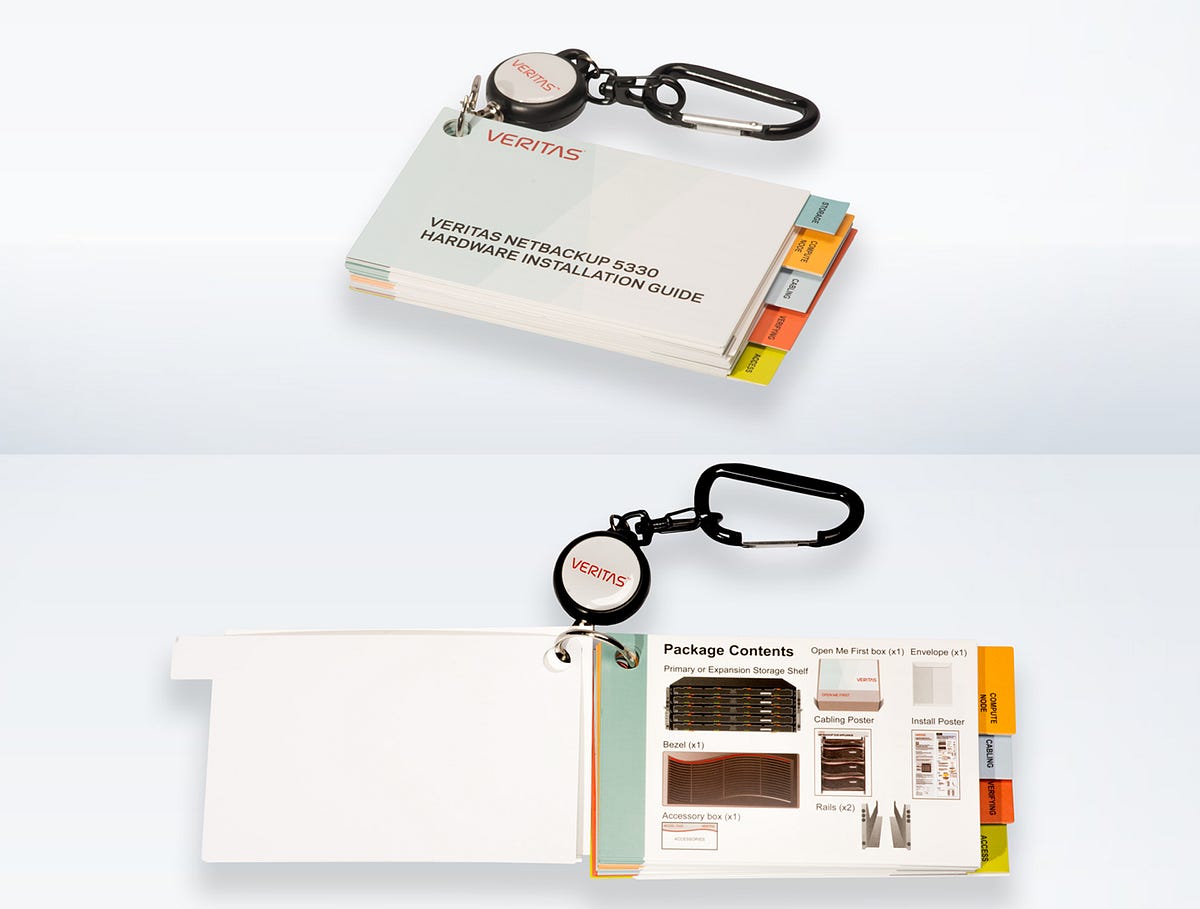
In 2015, the internal UX team initially created an interim solution, in the form of a set of flip cards. This was a neat idea, a lot more visual and portable compared to traditional PDF so that you could flip through to find what you needed visually. It also had a convenient keychain clip so that you could clip it to your cloth during the work for easier access. While this was quite an improvement compared to a PDF, it was not perfect.
Meantime, the whole world was moving ahead with everything becoming accessible via mobile phones. When everyone already had a mobile phone by default, not taking advantage of that seemed a missed opportunity.
This was where the internal UX team proactively took an initiative to bring in mobile as part of appliance hardware installation experience. This initial effort was lead by then-director, Jane Bungum working closely with Loren Horsager and Catherine Gillis from a SAAS startup company called Mobile Composer. After they successfully convinced Veritas top management, I joined the team.
How can a mobile app improve appliance hardware installation UX?
Just enough. Just-in-time. Hardware help in your pocket.
This was AppAssist tagline. Let me deep-dive into what this means.
Many data centers have very strict security rules, and don’t allow internet connection to protect servers from potential computer virus attacks and data breaches. So service engineers were forced to figure things out either by reading through static print documents, or calling Veritas support phone line for a help. These data centers are called “dark sites”.
Having all the necessary information in form of video in a mobile app could potentially improve service engineers’ appliance hardware installation experiences. But because of no internet connection at a data center, video streaming was not an option. So AppAssist went with a download model.
In today’s streaming-centric world, content download model sounds so outdated, but that was exactly needed to fulfill this specific user need in such a restricted environment. Welcome to the enterprise world.
Leveraging existing content through forming a multi-disciplinary team
The company already had several internal teams who were in charge of producing supportive contents including appliance hardware installation guides in form of PDF and videos.
Technically, no new content was created for AppAssist. Instead, AppAssist leveraged existing content already produced by internal teams, and focused on optimizing those content to fit best to this specific UX problem for specific users (customers and third-party service engineers) under a specific context (install appliance hardware at a data center).
In order to make this work efficiently and effectively, a multi-disciplinary team was formed.
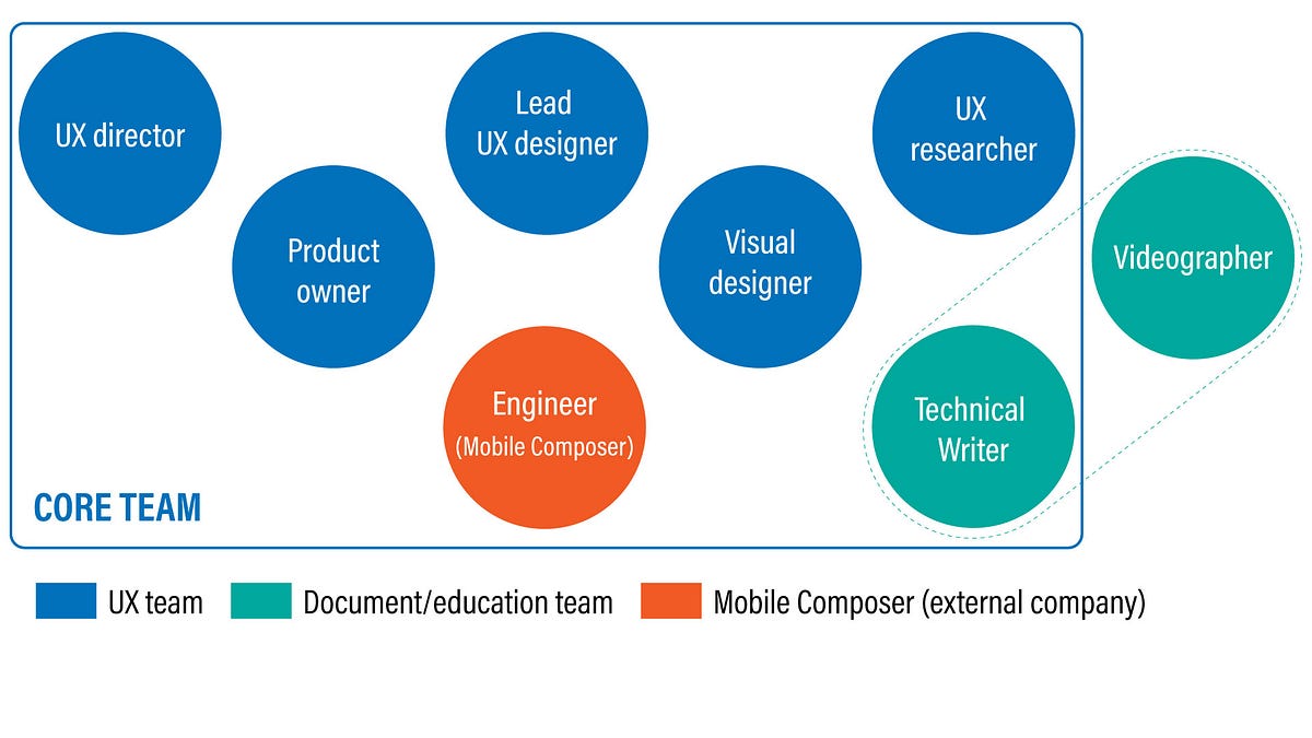
It consisted of a UX director, a product owner , a visual designer, a UX researcher, a technical writer, engineers from Mobile Composer, and myself as a lead UX designer.
Important thing to highlight here is that AppAssist team respected the existing functions that the company already had, and invited those people to join the team, instead of creating a new fancy position such as a “UX writer” and try to take things over.
For example, a technical writer who joined the team was the one who had always been in charge of producing technical guide documents. A videographer that I collaborated was the one who had always been in charge of producing instructional videos for educational purposes. The videographer was not exactly a member of the team, but I collaborated closely with him, and participated in his video shooting sessions so that the video was shot with mobile usage in mind. Kavita Bhalerao, a visual designer, even supported their video production by creating an animation that showed how to position server boxes into a data center rack.
What AppAssist team essentially did was simply utilized what already existed, and optimized those content into a mobile-friendly experience through content analysis, content reorganization, and user-centered design practice, through a tight collaboration among people from various different disciplines.
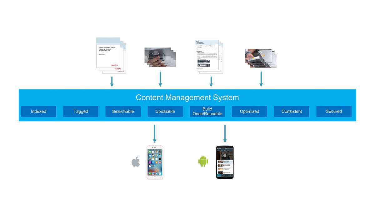
Because Loren Horsager from Mobile Composer was one of key members of this multi-disciplinary team, AppAssist was able to take full advantage of Mobile Composer’s SAAS platform, and plugged in all the content into its content management system (CMS), and utilized its analytics engine to learn usage patterns.
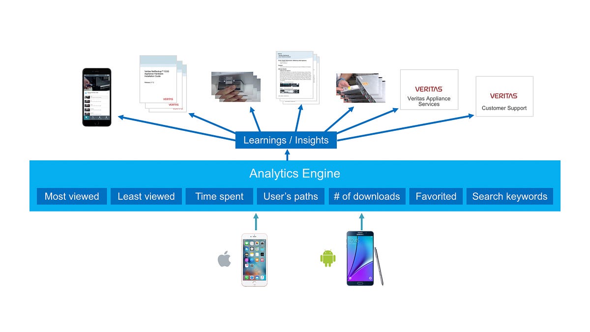
Mobile Composer’s CMS enabled content update on the app super-easy. This worked beautifully, so that Chad Busch, a technical writer was able to update pretty much any text within the app from a web-based CMS UI without having to publish a newer version of the app at app stores.
Mobile Composer’s platform was also capable of capturing detailed analytics data such as in-depth workflows of its users.
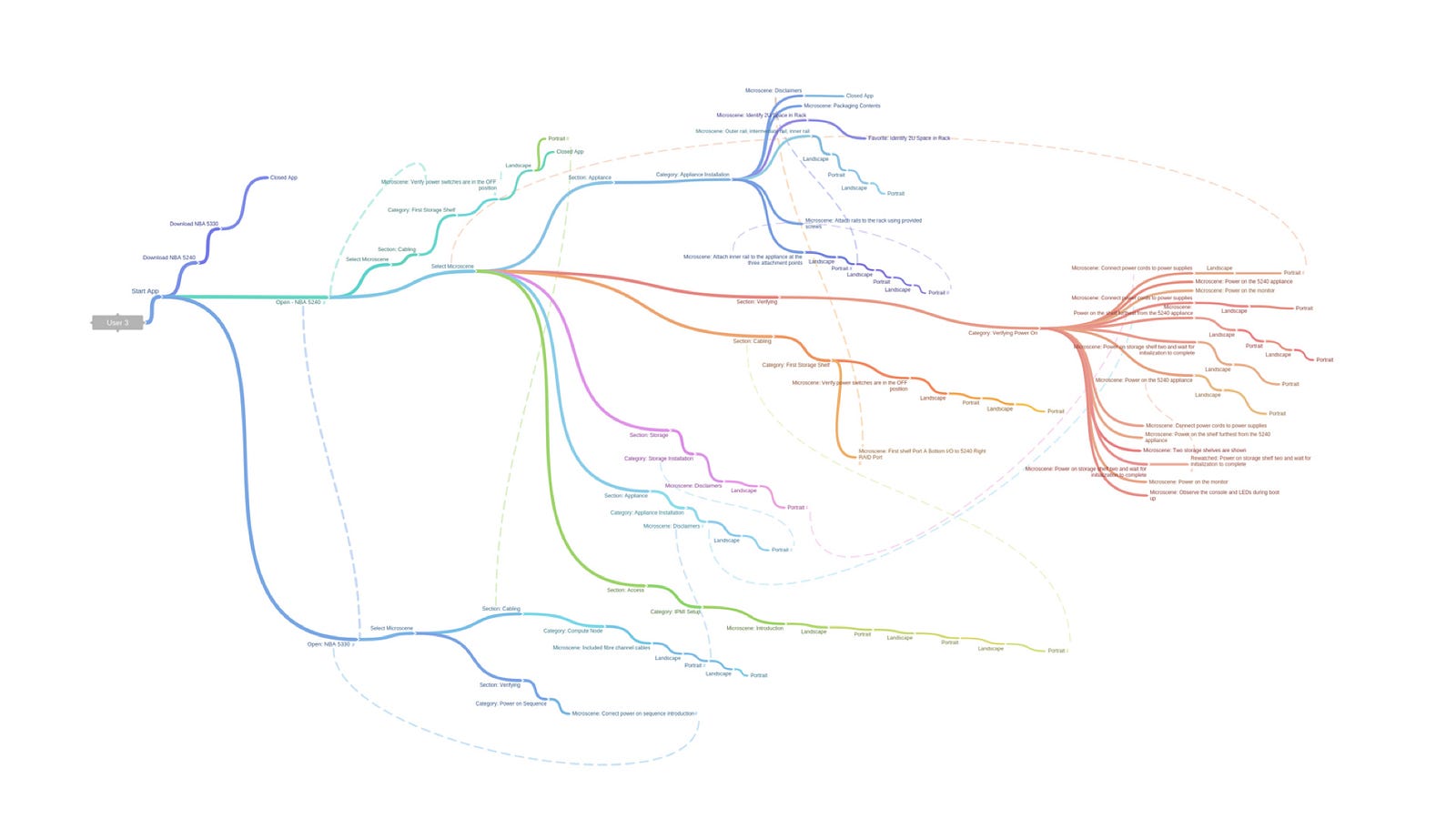
Jennifer Teves, a UX researcher created an intriguing workflow map above, which was a visualization of a 62-minute-long journey of one of AppAssist users. Through these analytics, Jennifer was able to further study how users were interacting with the app during their hardware installation works at data centers.
Concept development: Static flip card to video-centric experience
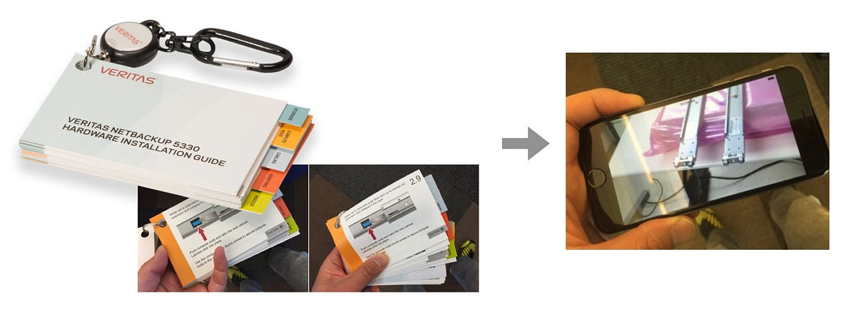
The physical nature of the original flip card made it a nice-to-have goodies. But at the same time, it had quite a few problems, such as pages easily got torn off and dropped from the ring, it was hard to update, you couldn’t see things in action/motion. Also a physical format felt a bit outdated in today’s world where everyone had a smartphone.
Mobile app introduced motion (video, animation), dynamic interactivity, and hyperlinks. Step-by-step procedures captured in video greatly helped a user’s cognitive understanding of how each step actually worked. In order to maximize this advantage, I had to design a mobile app with “video-centric experience” in mind.
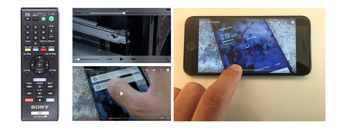
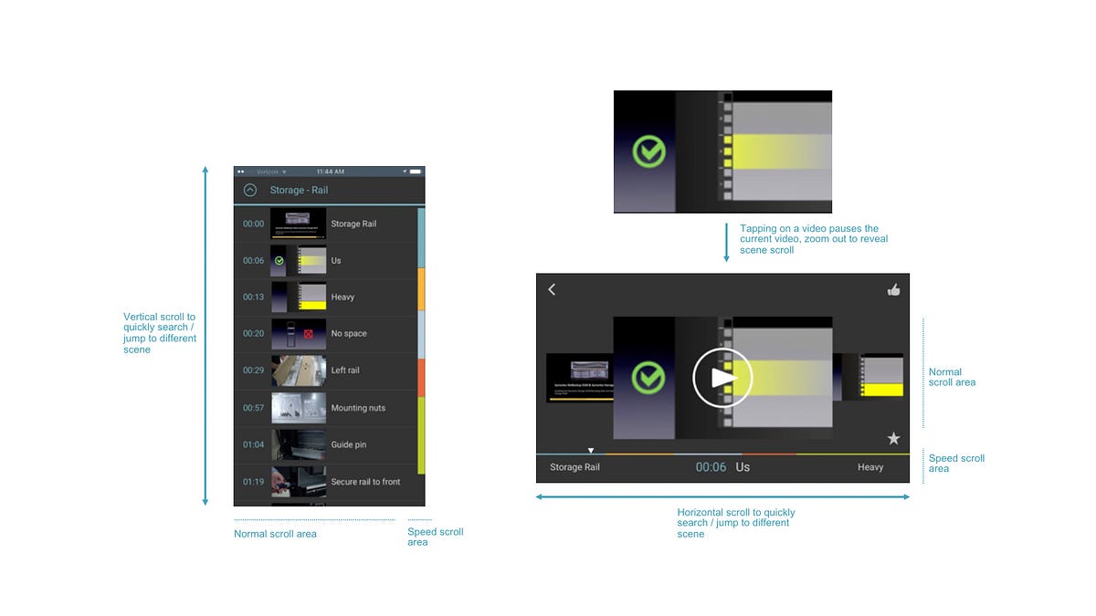
Traditional video transport controls such as fast forward, rewind, previous and next originated from mechanical controls for physical tapes, which only allowed mechanically-even incremental jumps forward and backward. This didn’t provide any meaningful + intelligent control as it didn’t consider content breakpoints. Modern mobile video players introduced an interactive progress bar that you can scrub through along the timeline, but this didn’t necessarily work well to find an exact scene that you wanted to go to either.
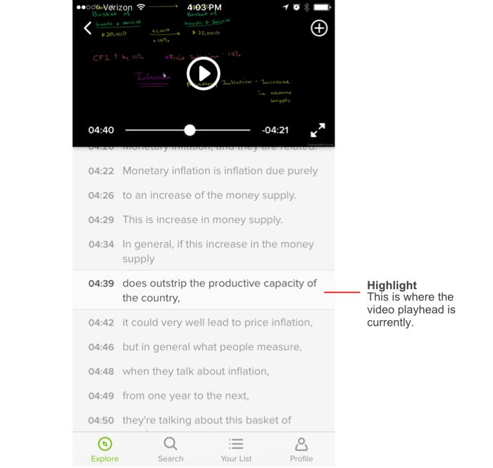
During the research phase, I came across Khan Academy mobile app, which had an interesting UI where it listed all the subtitles underneath the video like a playlist. A user could tap on any of those to actually jump to that point in the video. It allowed a user to scan through key moments within a video quickly, and jump right in to that scene. Everyone in the team really liked this content-oriented approach, and I took a cue from this reference.
Deep dive into content structure
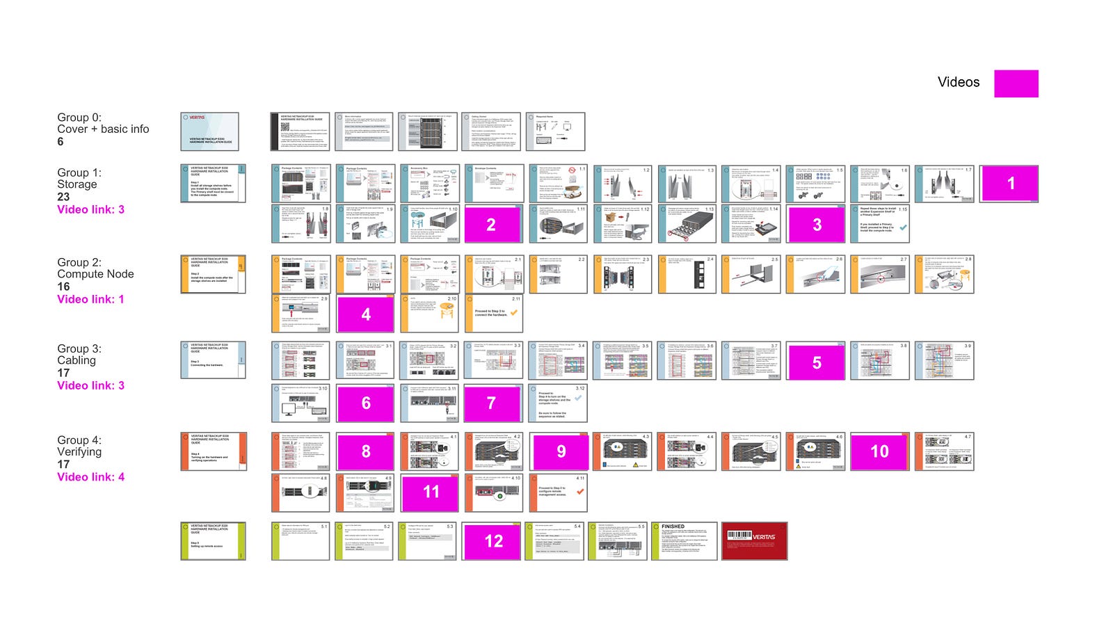
In order to create the best experience for a user, it’s critical to have a deep understanding of the content itself. As part of that effort, I created a structure breakdown of 88 pages of existing flip card. Magenta-colored pages indicated that those had QR codes that linked to relevant videos.
Breaking down videos into micro-scenes for better scan-ability and find-ability
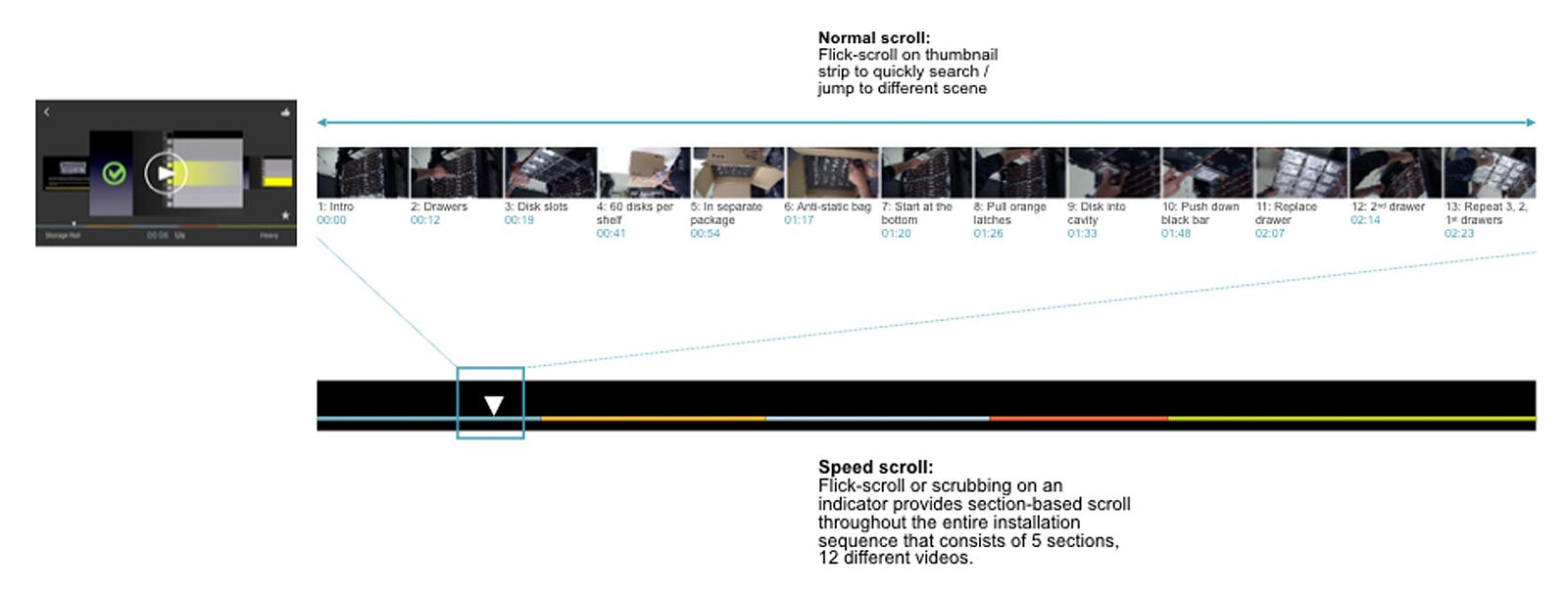
Video is a powerful media. It can show things in action, things in motion. It works great for instructional purposes. One of problems with video as a media format is find-ability of a specific scene within a video. To solve this, the team came up with a concept of “micro-scene”, which was a smaller component breakdown of a video, taking a cue from Kahn Academy app.
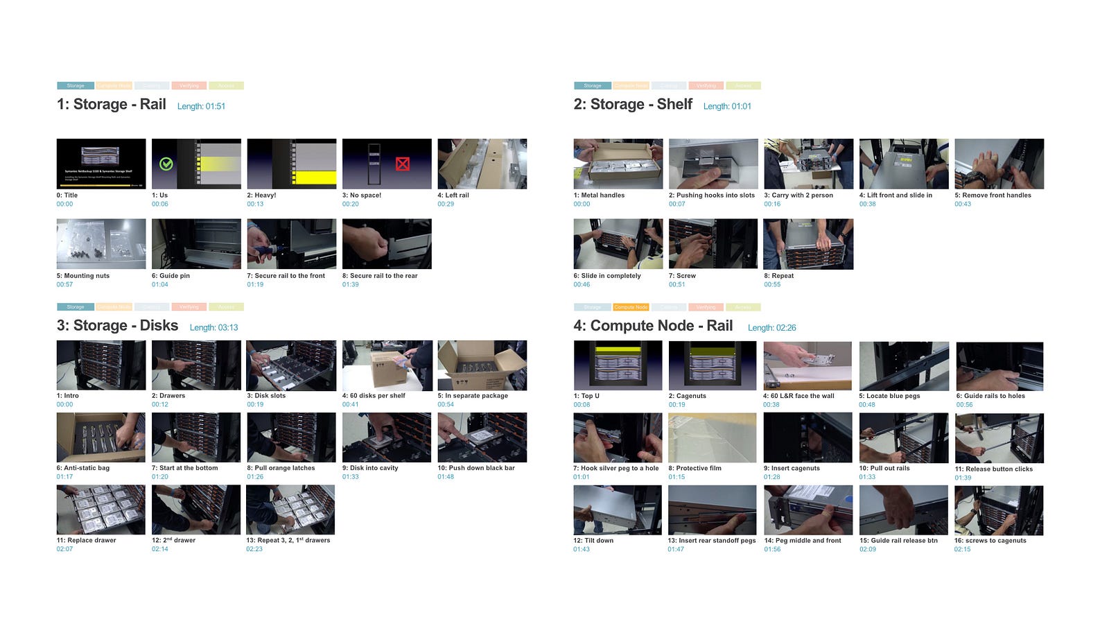
Below shows how each video was broken down into micro-scenes so that each micro-scene was labeled exactly with what it was showing.
This was a lot of work, and required a thorough understanding of the content. Fortunately, I was able to get a help from an expert in the team. Chad Busch, a technical writer, took on this task and did a great job breaking down videos into micro-scenes, recorded all the time stamps, and added every micro-scene a unique, easy-to-understand name.
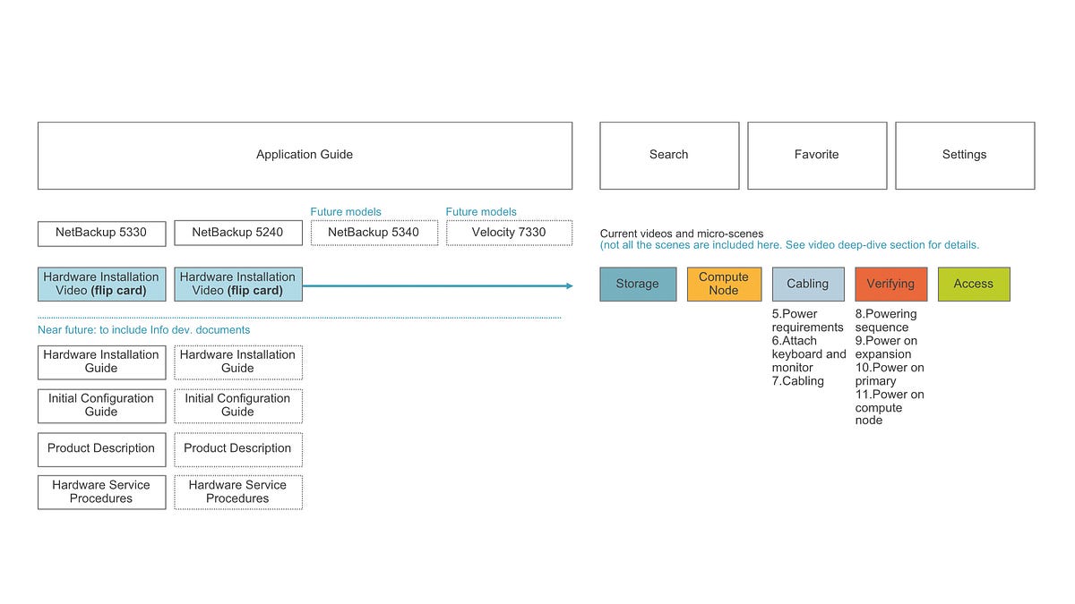
The overall information architecture of AppAssist was driven from a deep understanding of the content itself. Naturally, content was organized based on different appliance models, with each model having primary steps/categories such as storage, compute node, cabling, verifying, access, with each category broken down into a number of micro-scenes.
How to effectively navigate micro-scenes
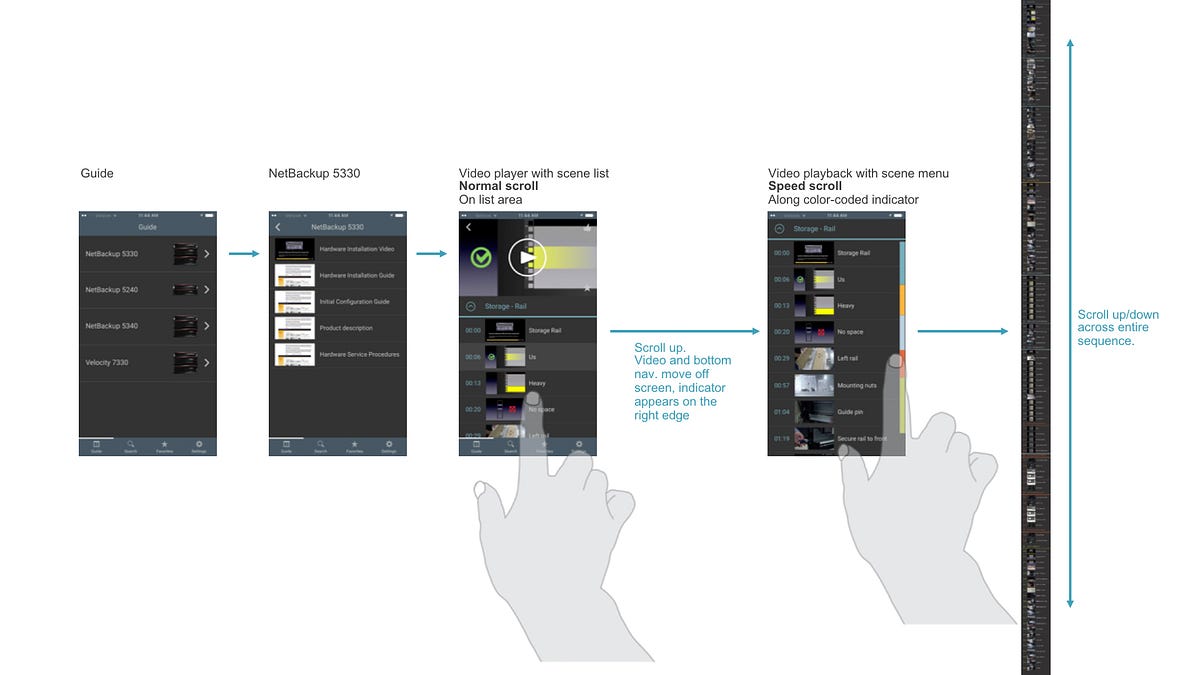
Once the content analysis was completed which informed the overall information architecture, the next step was to define an interaction model. Since how to find a specific scene within a video quickly was the core focus, I came up with two interaction models: a) flat model and b) hierarchical model.
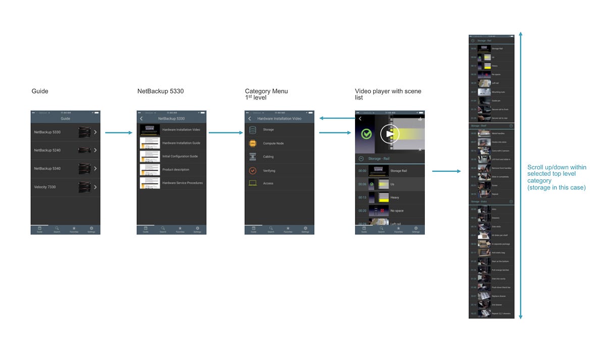
The flat model basically stitched all the micro-scenes across all 5 categories into one long list. The hierarchical model added a category page to pick a category first before getting to a micro-scene list.
When Jennifer Teves, a UX researcher conducted user research sessions, most participants preferred the hierarchical model over flat model, because this model was simpler to understand, and made it clear to them which category they were currently looking at.
I also explored a few different ways to help navigate micro-scenes faster, including speed-scroll feature. The portrait speed scroll never implemented, but the horizontal carousel view was implemented. Because AppAssist adopted hierarchical model, the speed-scroll became less relevant as the micro-scene list ended up shorter.
The version 1 launch
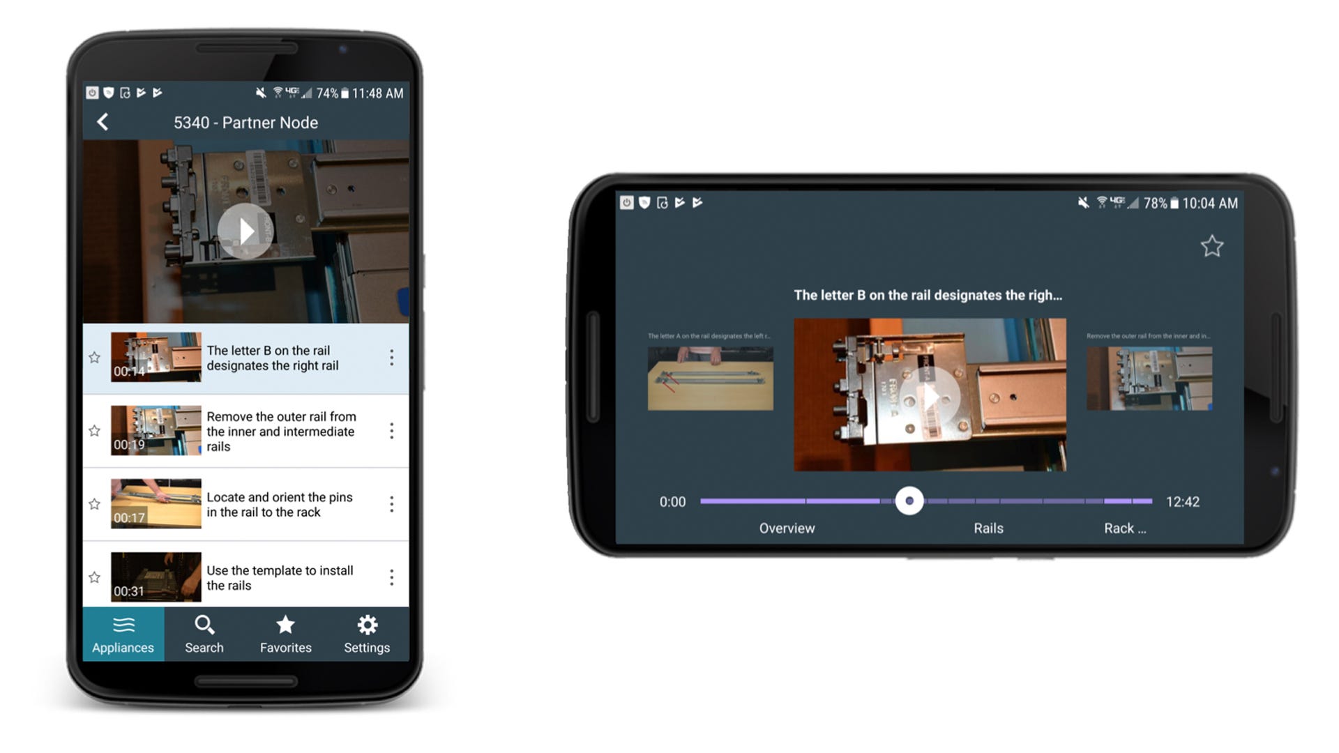
AppAssist version 1 launched in 2016. Essentially, it was a super-optimized hardware installation video for hardware service engineers, so that they can immediately find specific scene by scrolling through micro-scenes, and playback that part right away. It may sound underwhelming on paper, but it served the purpose, and was received very well by service engineers. You can see the app in action below.
Compared to a PDF or a flip card, AppAssist added substantial key values to both its users and Veritas internal teams.
- AppAssist provided an always-current, accurate hardware information that was easy to scan through and find what you needed.
- A web-based CMS made it super-easy for the internal team to update the content without having to publish a newer version of the app.
- AppAssist was able to track every interaction of its user to better understand both product needs and training, communication gaps.
- AppAssist reduced customer service calls by making information universally accessible. Support calls were expensive, so this was a big deal for the company.
The version 2 launch
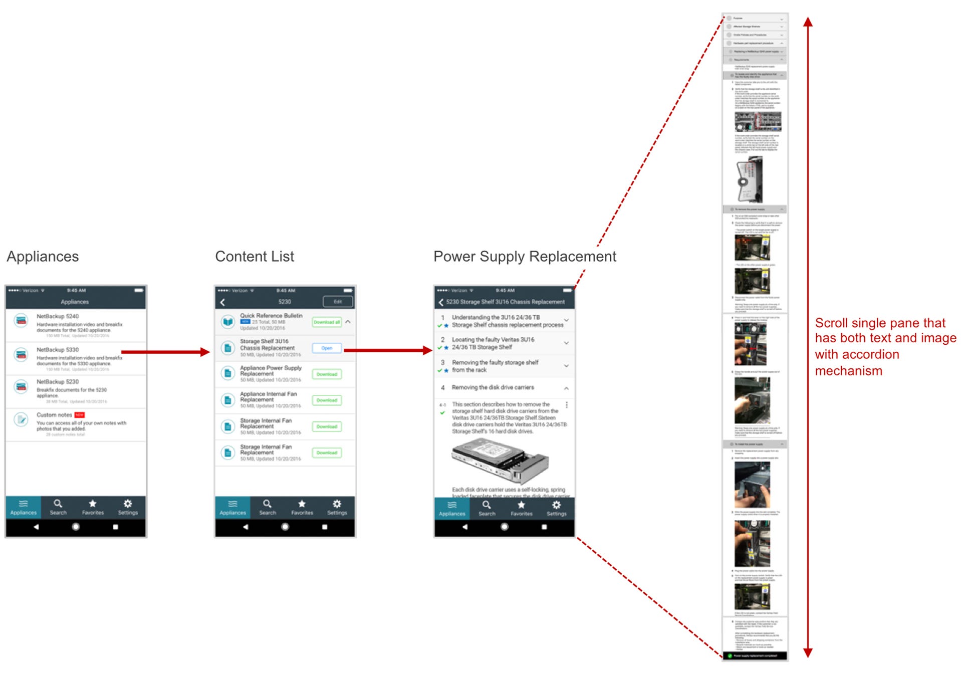
AppAssist version 2 launched in 2017. The version 2 added support for parts replacement guides. Just like hardware installation videos in version 1, AppAssist version 2 optimized already existing PDF guides to fit better to a mobile viewing experience in form of an accordion-structured format. These documents also adopted the content download model for the same reason as videos in version 1. It was nothing more than that. But it served the purpose well, and received very well by its users again.
Since launched in 2016, AppAssist had helped hardware service engineers install Veritas appliances, and replace hardware parts by having hardware installation videos and parts replacement guides in the palm of their hands.
Unfortunately, AppAssist discontinued in 2019 due to financial reason.
A rewarding experience
Even though it may not necessarily look like a fancy project, it gave me a very rewarding experience. I truly enjoyed the entire journey of launching version 1 and 2 of AppAssist. I felt very lucky to have had a chance to work as a lead UX designer for the project with such a talented, highly-motivated group of people, including Jane Bungum (director), Siddharth Mankad (product owner), Jennifer Teves (UX researcher), Kavita Bhalerao (visual designer), Chad Busch (technical writer), Loren Horsager (CEO and founder, Mobile Composer), Catherine Gillis (CMO and founder, Mobile Composer), and in a later phase of the project, Raj Rath (UX researcher), Mark Harris (technical writer), and Stephanie Kuo (UX/visual designer).
Everyone in the team contributed from different perspective and expertise, and formulated excitement and synergy throughout the project, which fueled fast-paced iterative design and development process.
In a nutshell, having an experience working for an enterprise product/project could give you a very rewarding experience, if you have a right expectation and a right mindset, and have an opportunity to work with highly motivated group of people.
It may look boring on the surface. But a true value lies beneath the surface. And that’s the beauty of being a UX designer, to be able to get down to reveal what’s behind the surface through deeper understanding of a user, content, a problem space, and an overall context.
Enterprise companies are more likely to have better, intimate relationships with their customers because of the nature of their businesses, which actually could provide a great UX research opportunities. So if you never thought of working for enterprise companies/projects that you’ve never heard of, consider those, as it might potentially reward you more than what may seem fancier.
Mobile Composer is a software startup company based in Minneapolis, Minnesota, specializing in mobile app development based on a SAAS platform. AppAssist was featured as one of their case studies on their website.
This article was also published on Medium in UX Collective.
As for content analysis, check out these articles too.